
Email signatures are often treated as a small admin detail. Most people add their name, maybe a phone number, and move on without thinking much about how their own signature actually comes across to the person reading the email.
That becomes a missed opportunity. A weak signature does very little beyond marking the end of the message, while a stronger one helps the recipient trust the sender and understand the next step without having to look for it.
For that reason, strong email signature examples are worth looking into before you build your own. In this article, you will see what the right email signature should include, which layouts work for you, and how to create one that feels just right.
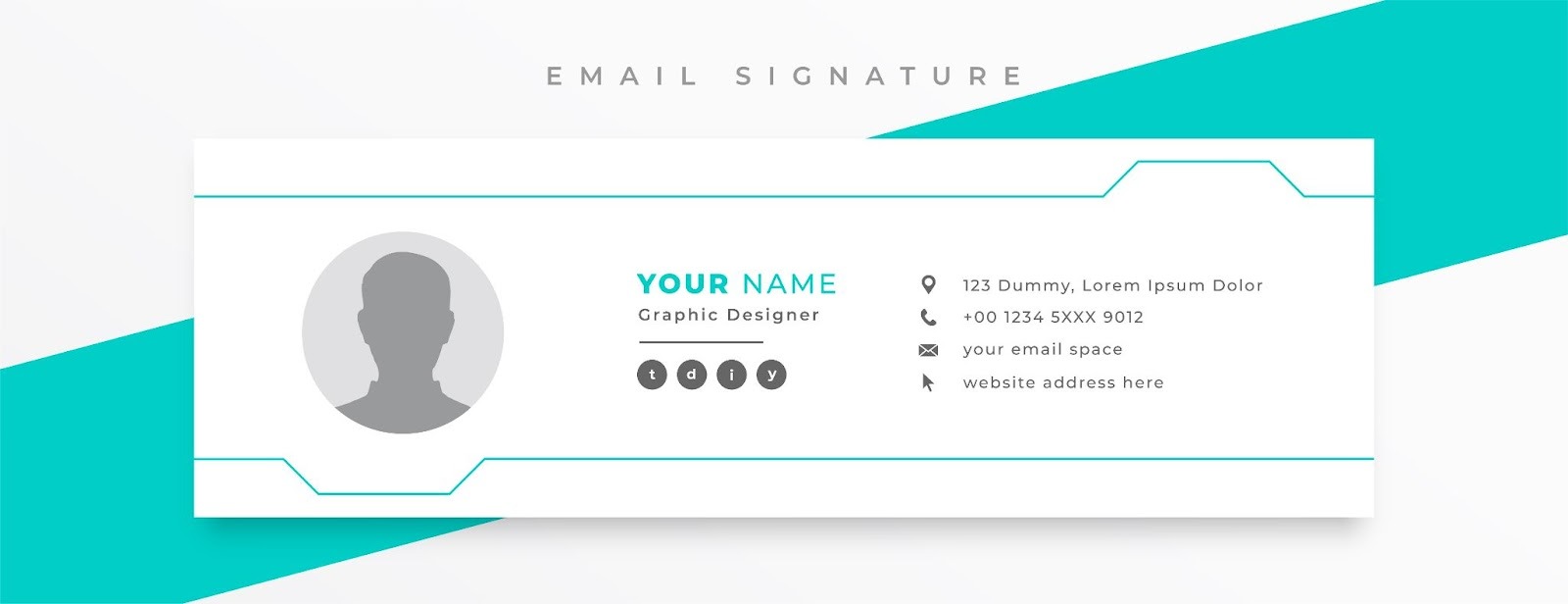
An email signature is the block that appears at the end of an email message. Basic email signature formats include your name, professional title or job title, company name, contact information, and sometimes a logo, profile picture, or a relevant link.
The best versions do not try to say everything. They give the recipient just enough context to know who you are, how to reply, and where to go next.
That small block does a lot of work in everyday email communication. It supports brand identity, reinforces brand recognition, and leaves a more lasting impression than a plain sign-off with just a first name.
It also helps when your message gets forwarded, copied into another thread, or read by someone who has never met you before. A clear signature keeps the sender visible even when the email makes rounds.
That is why most email signature examples tend to follow the same logic. They keep the essential elements in place, cut loose extras, and make the sender look easy to trust.
Whether you want a simple email signature or something more polished, the goal stays the same. Your signature should support the email, not compete with it.
A professional email signature feels complete without feeling crowded.
The strongest ones keep only the lines, links, and visuals that help the recipient do something useful next.
Your full name is the first anchor in the signature section. It tells the recipient who wrote the email, even if they only glance at the bottom of the thread.
Right under that, you should add your professional title or job title in plain language. Internal role labels often sound clear inside the company and vague outside it, so it helps to use the version clients or partners will understand right away.
A signature should make it easy to reach you through the channels you actually watch. That usually means an email address, phone number, website, or booking link.
You can offer multiple ways to reply, but every option should earn its place. If a number goes to a switchboard or a form rarely gets checked, it creates friction instead of helping.
A logo or profile picture can make your signature more memorable, especially when the sender is new to the recipient. For personal brands, a flattering headshot often works better than a big graphic because it adds a human cue without overwhelming the layout.
Keep the image small and easy to crop. A cluttered banner or an animated email signature may look clever in the editor and distracting in a real inbox.
Social media links should point to profiles that support your role, not just exist because every template leaves room for them. For most B2B senders, LinkedIn carries the most weight.
That is also why professional social media profiles work better than a row of mixed personal accounts. One or two useful icons help. Six icons usually dilute attention.
Most signatures need one clear link, not a stack of options. A founder might send people to a booking page. A consultant may link to a portfolio. A customer success manager can point people to the help center. You get the idea.
That single CTA works best when it matches the kind of email being sent. It is less about promotion and more about encouraging engagement at the right moment.
The best professional email signature templates are not the best because they look fancy. They work because the layout fits the sender, the information feels intentional, and the design holds up across different email providers.
Use these professional email signature examples as a starting point. Then adjust the text, visuals, and links to fit your role, your email platform, and the kind of emails you send most often.
Personal-brand signatures work best when they feel confident without sounding self-important. The sender should look established, but still easy to reach.
Minimal text-only signature is a strong fit for writers, solo founders, and consultants who prefer plain-text style emails.
This version usually keeps only the sender's name, professional title, company or personal site, and one direct way to reply. It feels clean, deliberate, and hard to break across devices.
A founder's signature with one booking link is useful for founders who spend a lot of time fielding intros, investor emails, and partner requests. A short block with a name, company, website, and meeting link saves time without turning the bottom of the email into a sales panel.
Personal-brand signature with a headshot works best for creators, coaches, and operators whose face is part of their public presence. A small profile picture beside the sender's name and site adds a personal touch that text alone cannot always carry.
An executive signature with one website link is a smart choice for senior leaders who want a polished finish with minimal noise. The structure stays lean, the website link provides the context, and the tone feels measured rather than promotional.
A founder signature should feel like a natural extension of the email itself. If the message is direct, the signature should be too.

Sales development representatives (SDRs) and business development representatives (BDRs) need signatures that quickly build trust. In an outbound email, small details can change how the message feels.
A basic outbound signature with a phone number works well for reps who want to appear reachable from the first touch. A direct line, company name, and short company URL make the sender feel real, which matters when the prospect has never heard from them before.
A LinkedIn-first signature for cold outreach is a good choice when prospects tend to vet the sender before replying. Instead of stuffing the signature with social media links, this version uses one LinkedIn icon or text link to give quick context on the rep's role and company.
A Calendly signature for meeting-heavy reps is helpful for teams whose main goal is to turn interest into booked conversations. The signature keeps the usual contact basics and adds a single scheduling link so the recipient can act without further back-and-forth.
An account-based signature with a company logo and a territory note is best for reps working on named accounts, regions, or verticals. A short territory cue can make the outreach feel more specific, while a small logo keeps the company visible without dominating the message.
In a sales email, the signature should remove uncertainty. It should never feel like a second pitch deck pasted under the email body.

Agency and consultant signatures need to look client-ready from the first email. They should signal competence without trying to impress through clutter.
A consultant signature with a headshot and website is ideal for independent consultants who rely on relationship trust. A clean headshot, a concise service description, and a simple site link tell the recipient who is writing and what they help with.
An agency signature with a portfolio link is a strong option for design, SEO, paid media, and web agencies. Instead of listing services in a long line, this version uses one portfolio or work samples link so potential customers can judge the work directly.
A service-led signature with one case-study CTA is useful when you want the signature to support warm lead conversations. One case study tied to the main offer gives proof in a quieter way than a large promo banner would.
A branded signature with a logo and direct contact line is best for agencies that want team-wide consistency. It balances brand identity with usability by keeping the logo small, the typography clear, and the direct contact path easy to scan.
For agencies, the signature should help the recipient feel that the sender knows their craft. Overdesign usually does the opposite.

SaaS signatures tend to work better when they feel human first and product-aware second. The product link should support the conversation, not hijack it.
An account executive (AE) signature with a demo CTA is a smart fit for AEs handling active sales conversations. This layout keeps the seller visible, makes scheduling easy, and gives the prospect one clean path to learn more when the timing is right.
A customer success signature with a help-center link is useful for onboarding, renewals, and support-adjacent conversations. A help-center link in the signature can reduce repeat questions because the customer has a resource before they need to ask again.
A growth or lifecycle signature with an onboarding resource works best for senders working on activation or nurture emails. Instead of a generic homepage link, this version points recipients to a setup guide, checklist, or onboarding page that matches the stage they are in.
Partnerships' signature with product page link is a practical option for integration, reseller, or co-marketing conversations. The product page gives context fast, which helps when the other side needs to understand the offer before replying.
Product teams usually get better results from relevance than volume. One useful link beats a cluster of pages every time.

Revenue operations (RevOps) and data-facing teams often benefit from a more stripped-down format. Precision matters more here than visual flair.
Minimal operations signature with direct contact details is great for internal coordination, vendor emails, and cross-functional handoffs. The emphasis stays on contact information and role clarity, which keeps the signature practical.
RevOps signature with documentation link is best when the sender often answers routing, systems, or workflow questions. A documentation link can stop repeated questions before they start and keep the process visible.
Data team signature with a request-form CTA is helpful for teams handling list requests, data fixes, and access questions. A single request form in the signature creates order and directs people into the right channel.
A Support-handoff signature with a functional contact path is strong for teams bridging support, success, and ops. Rather than leaving the recipient guessing, it shows the exact inbox or path they should use for the next step.
For operational teams, clarity is the design. A restrained signature often looks more credible than one dressed up with extra graphics.
Most weak signatures fail in familiar ways. The issue is rarely effort. It is usually a lack of restraint. Common mistakes are:
There are several ways to create email signatures, and the right method depends on how much control, speed, and consistency you need.
Some people want a fast new signature they can paste into an inbox today. Others need a team-wide format that behaves the same way across many accounts.
Design software makes sense when email signature design matters and you want more control over spacing, typography, images, and color palette. This is often the best route for founders, marketers, agencies, and consultants who want a more polished finish.
You still need to test the final version inside a real email client, because a polished mockup does not always survive the move into an inbox. This method suits senders who care about presentation and do not mind extra setup.
A free generator is the fastest way to build a business email signature without starting from scratch. Most tools guide you through the essential elements, then output something you can paste into your email provider or email platform.
This route works well for teams that want consistency with less manual design work. It also helps when you need professional email signature templates that are already structured for common inboxes.
HTML gives you more control over layout, spacing, and clickable elements. Teams often use HTML code when they want more consistency across users or need to keep brand rules tighter than a drag-and-drop editor allows.
That does not mean the best signature requires complex source code. In most cases, simple source code works better because it is easier to maintain and less likely to break in different inboxes. This method suits ops, IT, and brand teams managing several users.
Native tools in Gmail, Outlook, and Apple Mail are enough for many signatures, especially when the layout is mostly text with one image or link. You can go into the signature section, paste your content, and set it as the default signature for new messages or replies.
This is the easiest route for anyone who wants a quick edit without outside tools. It fits simple layouts and smaller teams best.
Strong signatures tend to follow the same discipline. They stay readable, controlled, and easy to scan.
A strong signature does not need to say everything about the sender. It only needs to make the next move obvious and keep the email looking trustworthy.
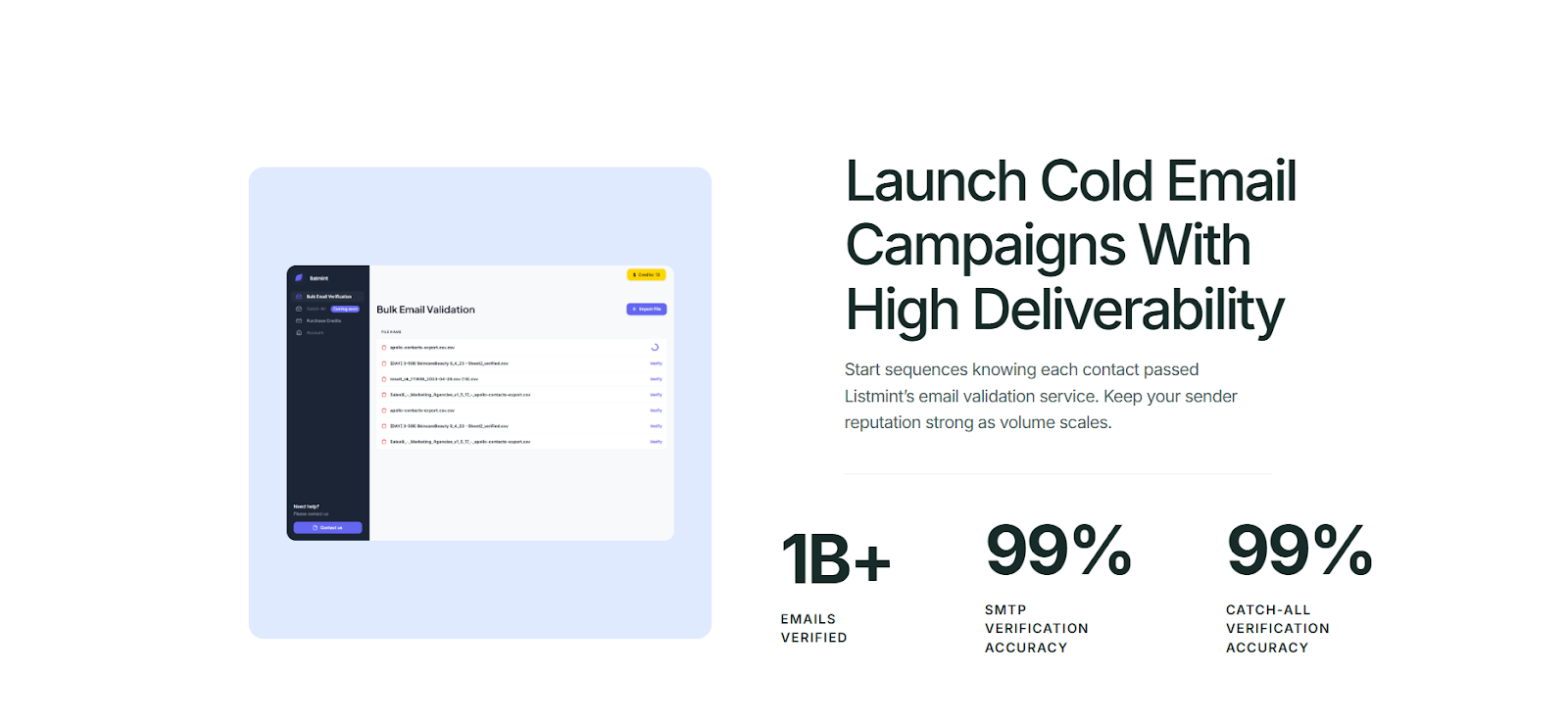
A polished signature helps once the email lands. It does not solve invalid addresses, bounce risk, or catch-all uncertainty before the message is sent. That part still affects email deliverability and sender reputation long before design comes into play.
Listmint fits that earlier step. It is an email verification platform with real-time catch-all verification for teams that want cleaner lists before they send.
Better signatures improve presentation. Cleaner data and a clearer view of catch-all verification improve the odds that your email reaches the right person in the first place.
Listmint helps with that by verifying addresses and giving you clearer answers to catch-all emails before you send. Try it for free today.
The safest format is still a short block with your name, professional title, company name, and one or two useful contact paths. That structure works across almost any email client and gives recipients the core signature details without clutter.
Yes, when the links point to active professional social media profiles. LinkedIn is the most common choice in B2B. A long strip of mixed social media links usually adds more noise than value.
They do. A lot of people now read email in dark mode, and weak contrast can make text, logos, and icons look broken. Check the signature in different email client settings before rolling it out widely.